Documentation
Getting Started
The information on this page pertains to the early access (alpha) release of the Stylebox Chrome extension. These documents will be updated as new features are added and as the extension is developed. If you have any questions please feel free to contact support from the profile page (when signed in).
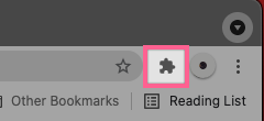
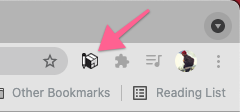
Pin Extension to the Browser Toolbar
The Stylebox extension icon can be pinned to the Chrome address toolbar for easy access. This icon can be clicked to launch and close the Stylebox editor.
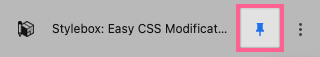
Opening & Closing the Stylebox Editor
Stylebox Editor Overview
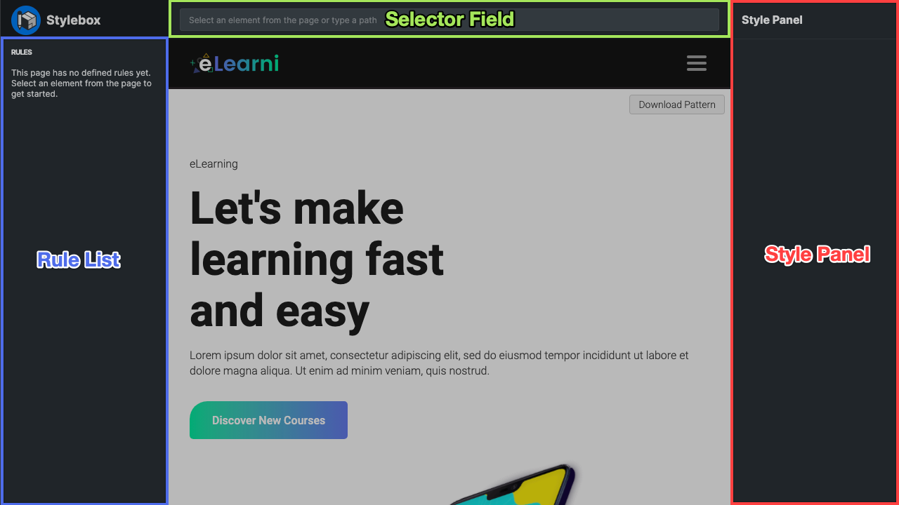
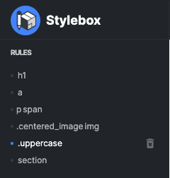
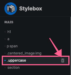
Rule List
The Rule List is automatically populated as you make edits. Read this description if you would like to know more about how it works.
If you would like to learn about CSS Syntax, check out this tutorial by W3Schools: CSS Syntax
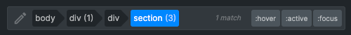
In CSS syntax, a rule consists of a selector and a declaration block. A selector is a path that points to the HTML element to be styled. A declaration block is where all of the style changes to that element are defined.
Selector Field
The Selector Field is automatically populated as you make edits. Read this description if you would like to know more about how it works.
If you would like to learn about CSS Selectors, check out this tutorial by W3Schools: CSS Selectors
The selector field is provided for advanced control over the selector path. It supports custom typed selector paths to any HTML element. This field is automatically populated when an element is selected from the page. Clicking on a Rule List item will also populate this field with the selected rule's selector path, that path can then be edited/modified to point to another element, multiple elements, or to an element that is in a certain state (hovered, active, or focused).
Style Panel
The style panel is where modifications to the style of any selected element are made. Just about any CSS property can be edited through the provided settings. Each field includes a popup control panel that helps with the adjustment of each property. Every modification made will immediately be applied to the selected element.
Styling Elements
Selecting an Element to Edit
Using the Style Panel
All style edits are made through the Style Panel. The style panel is only visible when an element is selected. It populates with the selected element's property values. For a definition of each of the adjustable properties please refer to the link blow.
CSS Property Reference: W3Schools CSS Properties
The Style Panel includes a few types of inputs to edit the element style properties. Each input type has an additional popup control panel for making easy and intuitive adjustments.
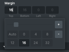
Number Inputs
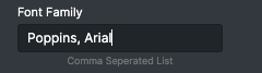
Text Inputs
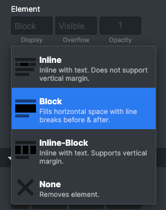
Select Fields
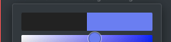
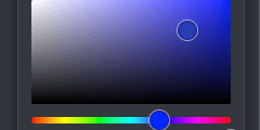
Color Pickers
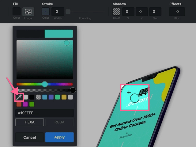
Properties that require a color value will open a color picker popup. The color picker has a few useful tools to help you select and apply colors. As you pick a color the page will update with your selected color. If you decide not to use the selected color you may click the cancel button for the color to revert to its previous color. Clicking apply will save the selected color. Clicking away from the color picker popup will also automatically save and apply the selected color.
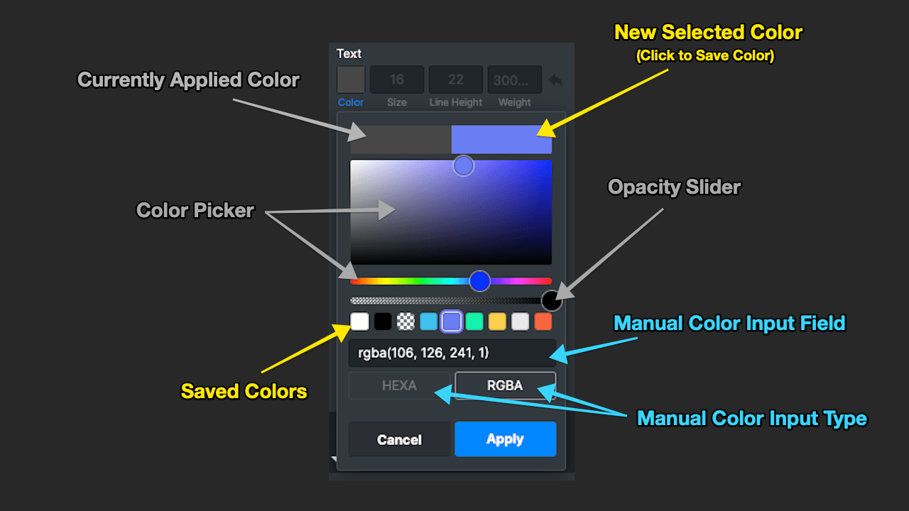
Color Comparison
Color Picker
Opacity Slider
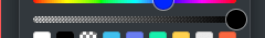
Saved Colors
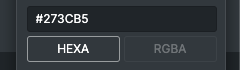
Manual Color Input Field
If you would like to learn about color values, check out these tutorials by W3Schools: HEX Colors & RGB/RGBA Colors
Reseting Styles
Advanced CSS Properties
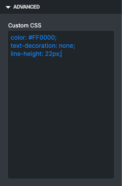
This field is intended for more advanced users familiar with CSS syntax.
If you would like to learn about CSS Syntax, check out this tutorial by W3Schools: CSS Syntax
Example:
color: #FF0000;
text-decoration: none;
line-height: 22px;
Using the Navigator
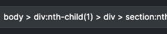
Some elements may be hard to select if they are nested tightly together. Clicking on any element will open the Navigator which can be used to select these hard to reach elements. If you would like to understand how the Navigator works we need to look at HTML element relationships.
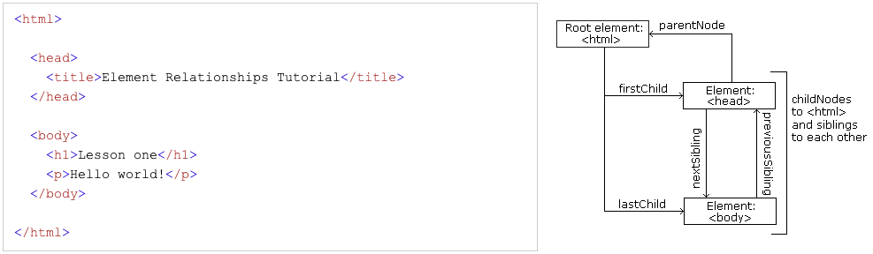
In this example diagram (found at w3schools), you can see that HTML elements have a hierarchical relationship to each other. The terms parent, child, and sibling are used to describe these relationships. Every element will have a parent and may or may not have any number of children. Siblings are elements with the same parent.
Selecting Multiple Elements
Editing the Rule List
Creating New Rules
New rules are added to the rule list automatically. This happens anytime changes to an element are made through the style panel. The currently selected element's path will be used as the rule's title.
There is also an option to delete the rule to remove any style edits made to that element through Stylebox.
Sorting Rules
The ability to sort the rules is provided for advanced users who have an understanding CSS Specificity Hierarchy.
If you would like to learn about CSS Specificity, check out this tutorial by W3Schools: CSS Specificity
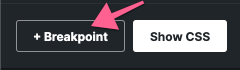
Adding Breakpoints
When using the Max Width condition, any rules added to the Breakpoint will only apply if the browser/window width is less than the supplied value. When using the Min Width condition, any rules added to the Breakpoint will only apply if the browser/window width is greater than the supplied value.
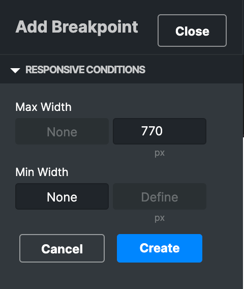
Condition Examples:
Max Width 700px = Rules added to this Breakpoint will only apply to windows and devices more narrow than a tablet in portrait mode (Mobile phones).
Min Width 700px = Rules added to this Breakpoint will only apply to windows and devices wider than a tablet in portrait mode.
Min Width 700px and Max Width 1100px = Rules added to this Breakpoint will only apply to windows and devices in the range of a tablet in portrait or landscape mode (Roughly).
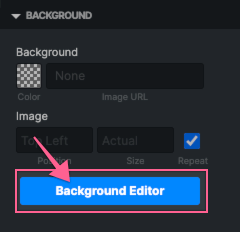
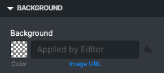
Editing Backgrounds
Inside of the Style Panel Background section is a special Background Editor button. Clicking this button will launch a full screen background image editor.
When the background editor is opened, it will automatically create a canvas equal in size to the dimensions of the element you were editing with the Stylebox editor. All of the element content will be generated as a layer that sits on top of the canvas to help you design around them.
The element contents can be hidden from the canvas by opening the View menu and deselecting "Show Content".
Background Editor Overview
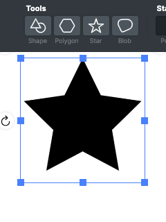
Shape Tools
There are currently four tools available for adding shapes to the background editor canvas. They can be found on the left side of the top toolbar. Clicking on any of the tools will add a new shape to the canvas with the exception of the first "Shape" tool. The shape tool will present a dropdown of currently selectable predefined shapes.
Style Settings
When a shape has been added or selected from the canvas the style settings will populate. They can be used to adjust the style of the selected shape.
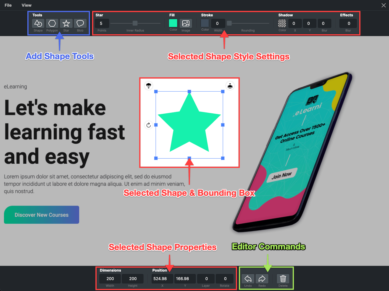
Bounding Box
When a shape has been added or selected from the canvas a bounding box will appear around it. The bounding box can be used to adjust the size of the shape. There are two layer adjustment buttons above the bounding box to adjust the stacking order or overlap of the added shapes. To the left of the bouncing box is a rotate button that can be used to rotate the shape.
Shape Properties
When a shape has been added or selected from the canvas its properties will be populated in the bottom toolbar. These fields supplemental to the bounding box and are provided for making fine tune or exact adjustments.
Editor Commands
A few action buttons are added to the bottom toolbar. They can be used to undo or redo changes you have made or to delete any selected shape or shapes.
Adding & Editing Shapes
The Background Editor currently supports adding predefined shapes to create background designs with. After adding a shape to the canvas it can be styled and positioned with the settings defined below.
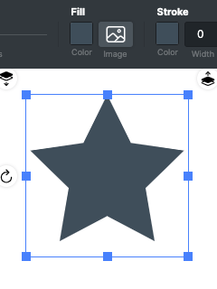
Shape Fill
The fill color defines the color of the shape background. Clicking the on this setting will open the same color picker found in the Stylebox Editor.
Shape Background Image
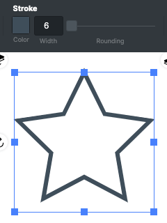
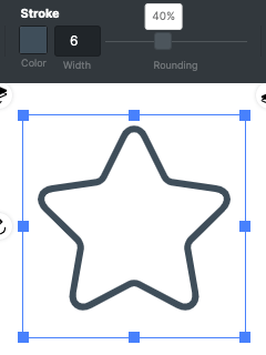
Shape Stroke
The stoke color defines the color of the shape border. Clicking the on this setting will open the same color picker found in the Stylebox Editor.
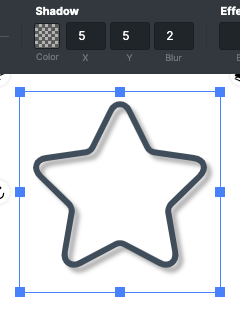
Shape Shadow
The shadow color defines the color of the shape's drop shadow. Clicking the on this setting will open the same color picker found in the Stylebox Editor.
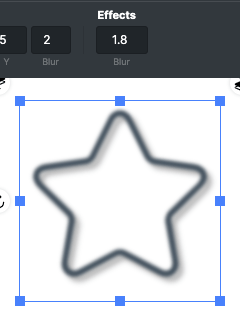
Shape Effects
Positioning
Shapes can also be positioned using the "x" and "y" input fields in the bottom toolbar.
Resizing
Shapes can also be resized using the dimension input fields in the bottom toolbar.
Rotating
Shapes can also be rotated using the rotate input field in the bottom toolbar.
Adjusting Layer Order
The shape's layer can also be adjusted with the layer input field in the bottom toolbar.
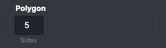
Using the Polygon Tool
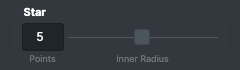
Using the Star Tool
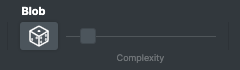
Using the Blob Tool
Saving & Applying Designs
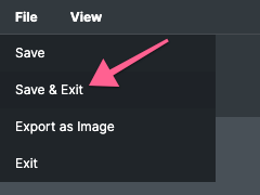
After you have finished designing the background of an element, click the File > Save & Exit menu option to save and close the editor.
A data URL will be automatically generated for your design and will be applied as the element's background image. This means you do not need to upload the image manually as it will instead be rendered directly from the CSS syntax.
If you would like to learn about data URLs, check out this article by CSS Tricks: Data URLs
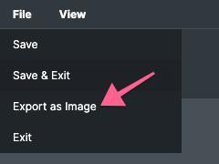
Exporting Images
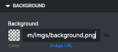
In some cases you may not want to apply your background design through a data URL. Data URLs can be long and if your CSS field wraps text it can take up quite a lot of visual space. Other times you may want to optimize the image yourself and upload it to a server. In these cases you will want to use the File > Export as Image menu option. This will download your design as a png image.
After downloading the image, click the File > Save & Exit menu option to save and close the editor.
Keyboard Shortcuts
ESC
Deselects the currently selected shape or shapes
DELETE / BACKSPACE
Deletes the currently selected shape or shapes
ARROW KEYS
When any shape is selected, the arrow keys will navigate to the closest in a given direction
CMD/CTRL + C
Copies the currently selected shape or shapes
CMD/CTRL + V
Pastes a copy of any copied shape or shapes
CMD/CTRL + Z
Undo
CMD/CTRL + SHIFT + Z
Redo
Using the Selector Field
The Selector Field is automatically populated as you select elements. The documentation in this section is intended for more advanced users familiar with CSS syntax.
If you would like to learn about CSS Selectors, check out this tutorial by W3Schools: CSS Selectors
Anytime you click on an element, Stylebox will generate a specific as possible selector path to that element. This way your style edits do not accidentally edit more than one element and so that the styles have more hierarchy over any styles that have been applied elsewhere. The downside to this is the selector path may include unnecessary elements that may only exist on the current page, which will be a problem if you are applying the CSS across multiple pages.
To help with this the Selector Field is supplied. This field allows you to create your own specific selector paths or edit any automatically generated paths to fit your needs.
Creating a Custom Selector Path
When you have finished typing the path press the return/enter key to confirm the path and select the matching element or elements.
Editing a Selector Path
When you have finished editing the path press the return/enter key to confirm the path and select the matching element or elements.
Using Selector Pseudo Classes
When a rule has been added to the rule list, you may select it to get access to a few quick pseudo class buttons. First, select a path from the rule list that you would like to edit.
Custom pseudo classes can also be added manually when editing the selector path through the edit button found on the left of the Selector field.
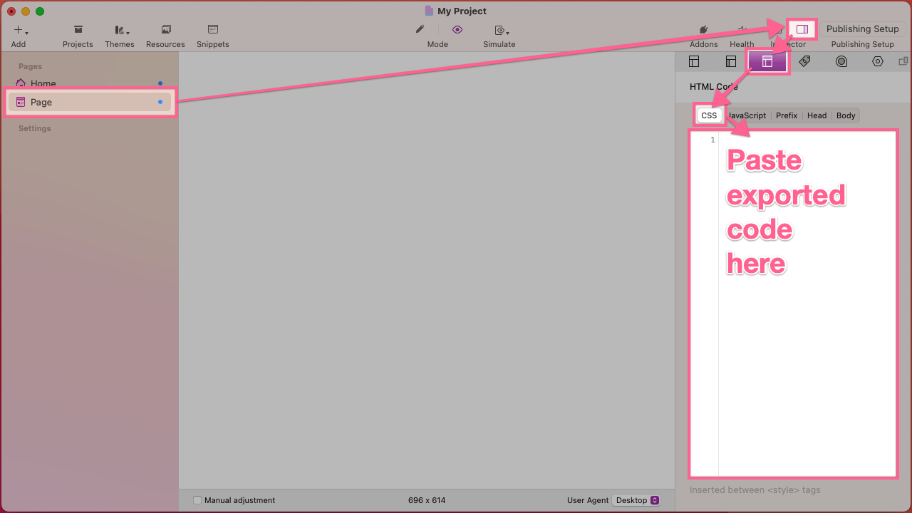
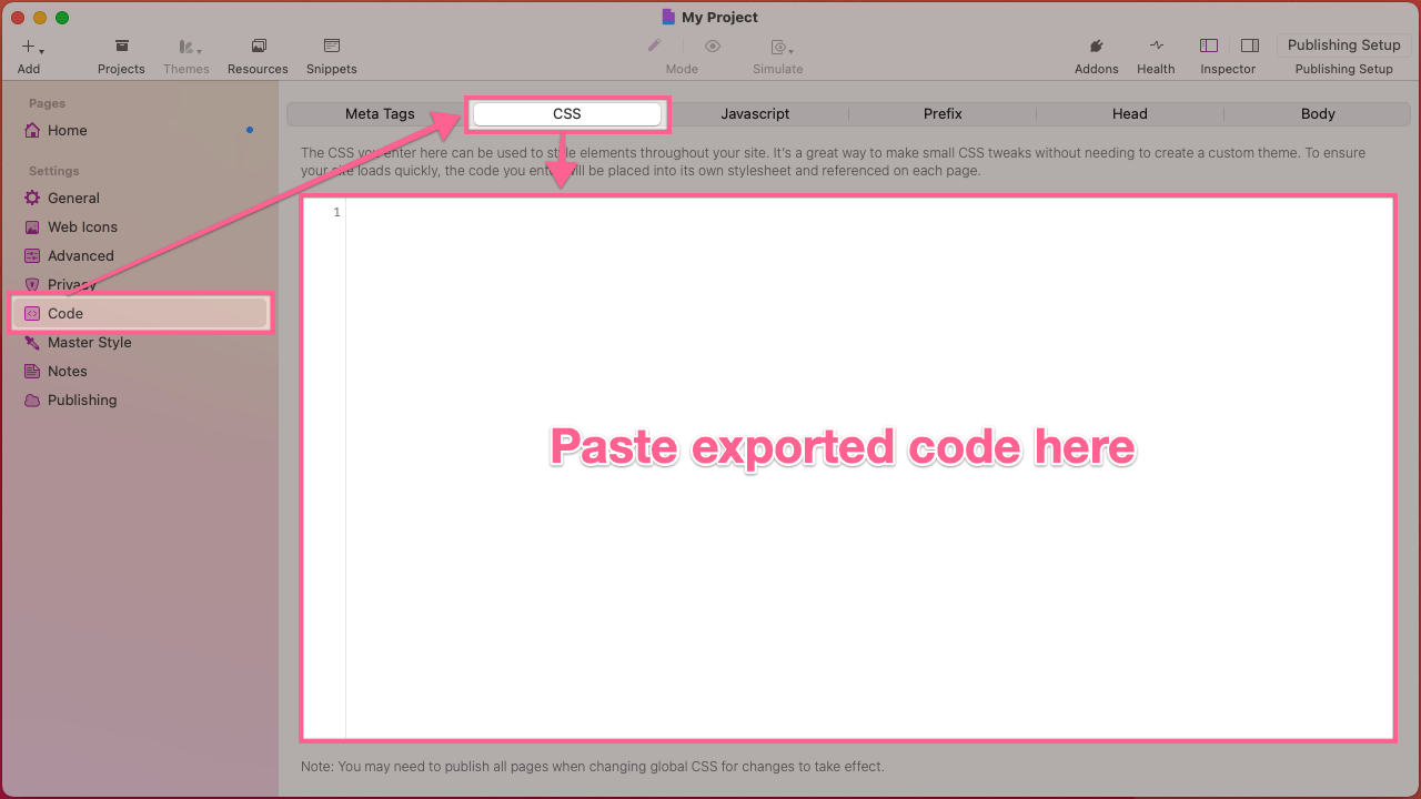
Exporting CSS
Exporting and applying the changes made through the Stylebox editor is quite simple. Just click the Show CSS button in the bottom left corner of the Stylebox editor. The CSS syntax will then be displayed along with a Copy CSS button. Click the button to automatically copy the generated CSS syntax.
Now navigate to or open your web design software of choice. In the provided custom CSS area paste the copied CSS syntax.
Exporting to RapidWeaver
About Us
We are web designers & developers who want to create the tools we wish we had. Our goal is to provide useful, intuitive, & convenient software that can help you save time & make better websites. We are dedicated to constantly refining our work so that we can all improve together.
© 2021 One Little Designer